Role
Creative Director
Visual Designer
Timeframe
6 weeks
Skills
Graphic design, brand analysis, color, composition
Software
Fireworks, Illustrator, Photoshop
![]()
![]()
![]()
The Opportunity
After 35 years of business, London Aviation Underwriters, Inc. needed to revisit its image, personality, and core purpose… and how this was communicated to its customers.
The initial challenge was to demonstrate that branding is more than a new logo or face-lift. It is the personification of an organization and has a reputation… even a personality. Brands are not optional… but managing them is.
Strategy, Process, & Goals
As with all projects, I like to start by asking a lot of questions to get to the heart of the matter, in this case, what is London Aviation Underwriters about, what do they stand for?
Redefining a brand is an exercise not to be taken lightly.
Clients usually think it’s about picking a color or just a new logo. Conversely, it’s much more than that.
While the actual deliverables are covered by NDA, I’d like to walk you through my process.
Brand Strategy Deliverables
Audience Perception & Drivers
Competitive Overview
Core Brand Attributes
Brand Personalities
Brand Affinities
Brand Anthem
Brand Questionnaire
Work began with the London Aviation Underwriters questionnaire. I had LAU answer questions such as:
- Do you have a mission statement? Do you agree with it? Why or why not?
- What services do you offer?
- Why does LAU exist? (…and go deeper with the 5 Why’s)
- Who are LAU’s competitors and how do you perceive them?
- How are your offerings different or better?
- What value do you want your customers to see you as offering?
- How do your current customers see you?
- What words do not describe LAU and why?
Discussion & Information Gathering
I evaluated the questionnaire LAU filled out. I took a look at who they listed as their competitors and performed research on my own of the competitive landscape.
![]()
I prepared some exercises to work through as a group. We narrowed down the brand traits through limit exercises where a trait is described along with a meaningful, but not exact opposite statement.

What drives audience decisions?
Over the course of three weeks, the brand deliverables were created and agreed upon.
Typography & Color
Original Brand Elements
![]() We discussed the original logo, brand elements, and feelings around these materials.
We discussed the original logo, brand elements, and feelings around these materials.
Black & White
Three revisions of logos were submitted to LAU for discussion, all with no color, so we could concentrate our discussions on the form and meaning, without introducing other distractions into the conversation.
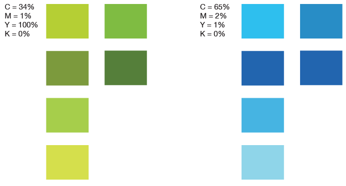
Color
Color swatches embracing the new brand personality were introduced. The new colors spoke to on-brand ideas like new, fresh, financial, secure, modern, and clean.
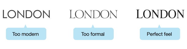
Typography
We experimented with san serif and serif typefaces to fit the new brand personality. We quickly eliminated the “modern-technology” feel of san serif fonts and expanded our search of serif typefaces.
Transitional serif typefaces seemed to fit the brand better than Old Style or Modern families. The winner was Dutch 801 Headline.
Logo & Typeface Evolution
Below is a quick evolution of the new London Aviation Underwriters logo:
![]()
Brand Implementation
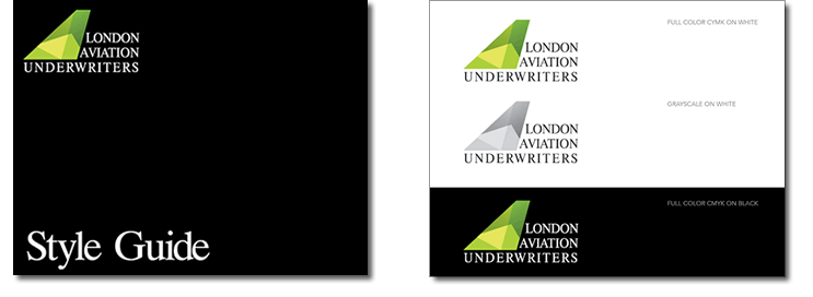
Style Guide
To provide standardization in both print and digital media, I created a Style Guide. The guide defined logo parameters, colors, and typography.
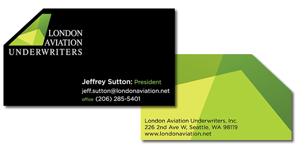
Business Cards
Card specialty treatments included dual card stock, glued together for extra thickness, diagonal cut to spotlight the aircraft tail, and embossing: logo text and a skeleton emboss of the tail (each color section was separately embossed).
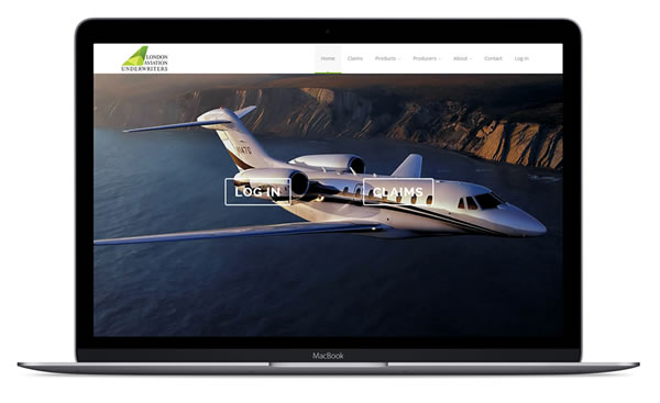
Website
The London Aviation Underwriters website underwent a complete overhaul, modernizing both the technologies used and brand image. The project included two websites: an external WordPress website, and a matching, internal HTML 5 website.
Final Product
Lessons
Branding is always a touchy subject. Why? It’s your client’s – they own it… or at least they think they do… and it’s a very personal thing. But, as the saying goes, “Your brand isn’t what you say it is, it’s what they say it is.” Try telling a client that.
I learned that you can guide a client through this process more gently by allowing them to discover this on their own. Do I have a formula? No, but I learned that the more brand exercises you can walk through with a client, the more apt they are to unearth the gold that can be found in these exercises. Just as we are individuals and certain ways of speaking appeal to us more, so it is with stakeholders and company owners.
Retrospective
I think it’s always good to ask ourselves why we liked a project or not. This can reveal great insight into our passions, weaknesses, or just plain things that we don’t like to do. Maybe we need more familiarity or expertise with a subject. Whenever I don’t touch Illustrator for several months, I hate the program. But once back in… when I reach the point where my mouse and keyboard produce exactly what my mind is thinking, I’m back in my FLOW.
For me, typography was a love/hate relationship in this project. So, to solve it, I’ve set some time aside to study it more and per suggestions from UX friends, I have some great books on order.