“Mobile clearly forces you to decide what’s most important.”
Founded in 2001, Payment Systems Group had worked through several evolutions of their payment platforms. In 2013, the decision was made to move into the mobile app space.
Role
UX Director
Timeframe
9 months
Skills
Team leadership, visual design, interaction design, user testing
Software
Illustrator, Photoshop, Balsamiq
![]()
![]()
![]()
The Challenge
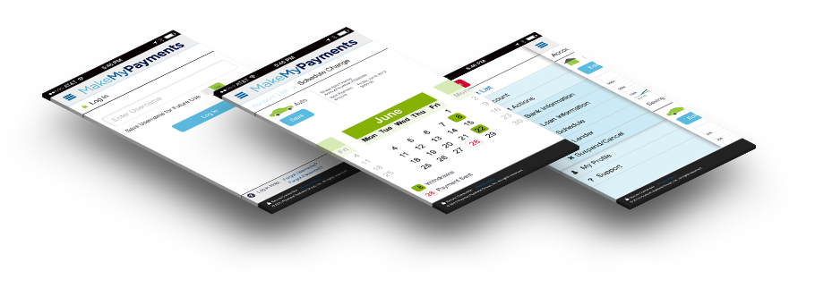
Payment Systems Group recognized that its customers were increasingly using smartphones and that its current website didn’t support mobile devices very well.
We needed to design and develop a mobile app for smartphone customers. The array of account management capabilities on the desktop version made this a daunting task. In order to not create an extended waterfall project, we let Agile development be our guide – create a minimum viable project with features added in quick succession.
Research
In order to launch a viable product with value to our customers, we first had to learn what that was. What would customers need? What do they do most often? Are their behaviors different if managing their account from home or on the go?
We wanted to use two sources for our research – data and customers. Google Analytics was used to provide data on what functions customers used the most and what were the most common tasks. Next, we wanted to explore the minds of our customers.
Our goal was to explore customers’ mental model and stay away from specific site functions (engineering model).
We performed a task analysis of every major function on the customer portal. This gave us an initial guide to what we could bite off for version one and what would be left to tackle later. We created surveys and interviewed current customers and also people that didn’t know about the program.
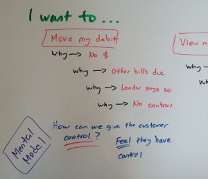
Then we were guided by “The 5 Why’s.” For example, the Make My Payments website offers some very sophisticated scheduling. Should we simply replicate that or is there a deeper purpose to each customer’s actions? A customer wants to move an upcoming debit to a different date. When does this occur? Why does this occur? It’s not enough to simply know other bills have come due and they want to move this one. Several “whys” later, deeper answers flushed out.
| Question | Answer |
|---|---|
| Problem: | A customer wants to move their debit. |
| Why? | They won’t have money in their account this Friday. |
| Why? | They have other bills due. |
| Why? | Many bills are due on the same date. |
| Why? | That’s the way they were scheduled by the vendor. |
| Why? | The vendor has ultimate control – not the customer. |
Revealing Deeper Issues
So, is the problem not having sufficient funds this Friday?
Or is it that they have no control over everything being due at the same time?
Perhaps a solution then is to offer flexibility in the date their loan payment is due. Aha!
Planning
Problems We Faced
- Since mobile is an entirely different animal from desktop, we didn’t want to assume we knew where customers would go for performing tasks.
- We wanted to solidify where future items would go, even though they wouldn’t be put in version one, the minimum viable product.
- As a unique service, not many features/functions fell under “conventional categories.” For example, while most customers might expect the ability to change their email address to be under “My Account,” where would “Change My Lender’s Payment Address” go?
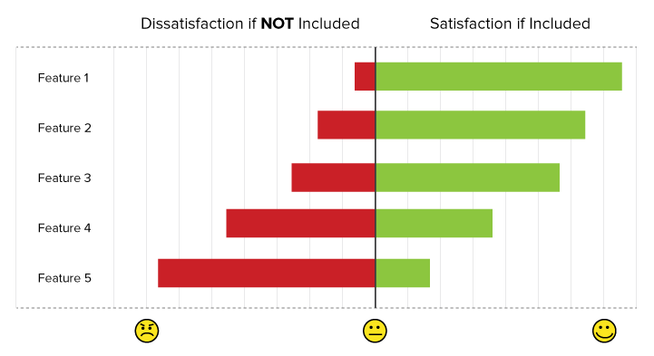
- We wanted to differentiate items for a Kano Analysis: required, desired, exciters, neutral, and dissatisfiers, to help us know what needed to be in the app.
How We Solved It
We asked! We used Directed Storytelling to avoid asking, “what are you trying to do?” but rather we engaged them to tell us a story about why they would need to check their account from a mobile device. “You’re going about your day and suddenly your bill pay account comes to mind… tell me what’s going on.”
It was most important to know customers’ goals, not tasks.
This allowed us to create Concept Maps and Affinity Diagrams. We began to see how customers aligned tasks with goals and more importantly, what they were thinking. Again we were putting the customers’ mental model first.
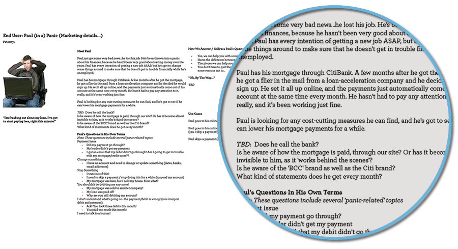
Fortunately we had already developed personas from a major redesign we did shortly before the mobile app project. We were able to take these already developed personas and bring them into the dialogue.
From the concept maps, affinity diagrams, and personas, we constructed our scenarios and use cases. I made the decision to bring in our development team at this point and get feedback from them before we moved on to design and prototyping. This way, we at least had a “yes, this is feasible” signoff. Anything outside this realm got put to the side for later.
Prioritizing Features
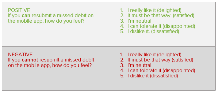
We wanted to prioritize features, not based on guesswork, but on the expected impact on user satisfaction. We used the Kano Analysis to help us. We categorized all the features that came from our current website as well as anything new from our customer research.
For example:
- If the app allows you to change your debit date, how do you feel?
- If it does not allow you to change your debit date, how do you feel?
Based on answers such as, “I love it,” “I expect it,” “I don’t care,” “I can deal with it,” and “I don’t like it,” we were able to categorize and prioritize features.
Design & Prototyping
As our first effort at an app, we felt it was prudent to spend plenty of time in sketches and low fidelity mockups.
This was probably one of the best decisions we made as it allowed us to change rapidly with a very low investment in resources and direction. As they say, “iterate early and often.” So true!
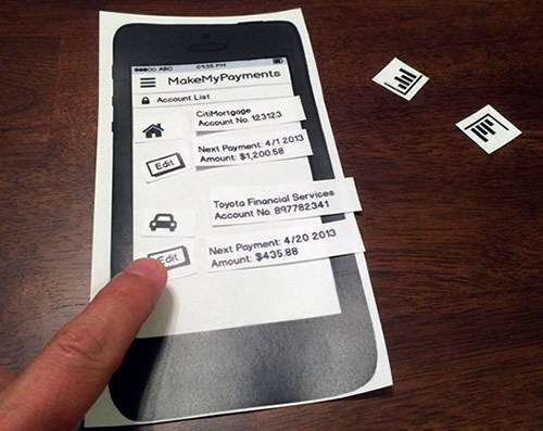
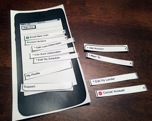
We performed generative research by creating cutouts so users could easily swap screens and buttons. This allowed users to create what they wanted and afterward, we would ask why they made the decisions they did. We performed several usability tests with paper mockups just to test out ideas and get user’s reactions. We brought the development team back in and called it an “arts and crafts” session. Oddly enough, it was a really fun event and garnered significant buy-in from the developers. After all, they weren’t just told what to do, but were able to “own” suggestions and ideas. After several iterations of paper mockups, we moved on to wireframes in Balsamiq.
Usability Testing
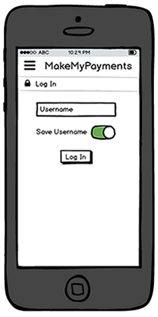
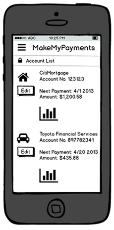
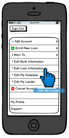
Our Balsamiq wireframes were then put out to the test. We performed five studies with eight participants in each group. Balsamiq was a great tool for this, again because of minimal investment in product creation. We were able to quickly iterate, update our script and questions and perform another test.
Lessons
This was an enormous project and there were lessons learned and things I would do differently.
It’s very easy to take too much ownership of an idea and I believe two things in particular led to this: 1) Too much investment in the idea (time, effort, etc.) 2) Being a SME (Subject Matter Expert). SMEs see things differently. We see the front end, the back end, know how much work is involved to program something, and it’s easy to get too far from the user’s mental model. Use people who don’t have an investment to keep you objective.

Retrospective
Usability testing was one of the most difficult stages for me. There will always have some level of disappointment in user testing. I thought several times that we had failed miserably. You’ve got to let it go and make the user priority #1. Doing this will enable you to rise again from the ashes and come out with a remarkable product. As a designer at heart, I always strive for perfection… but while most of the time, that’s a good thing, our ideas aren’t always a great user experience. People come from different places, differ mindsets… that’s why we test, and test again, and again. Release. Test. Release… get it?

