Explosive growth, larger design team... no design system.
Highlights from creating Pacaso's design system from the ground up.
Role
Design Systems Lead
Timeframe
10 Months
Skills
Visual Design, Component Design, Accessibility Compliance
Software
Figma
Why This Piece?

I've had the privilege of working on 5 design systems prior to Evergreen. However, Evergreen was unique in that it was the first complete design system I created from ground zero in Figma. We literally purchased our Figma plan the day I was hired.
Rather than illustrate every step of the "UX Process," I've chosen to illustrate some of my favorite highlights.
Pacaso's New Color Ramp
Challenges
Color is one of my favorite topics!
Color becomes even a greater challenge when you need to be "on-brand," accessible, meet all the requirements for compliant components, and use light and dark modes on devices.
Pacaso had been moving quickly and the original color palette met none of these requirements, except for being "on-brand."
Technically speaking...
- Primary and secondary greens didn't meet basic color compliance. Neither did the grays, blues, or reds.
- There was an insufficient set of colors for component creation (think borders, backgrounds, etc.).
- Some colors didn't even belong in the same "family of colors," such as Cream and Garlic. Grays varied in the amount of purple saturation.
- No dark mode colors.

Explorations
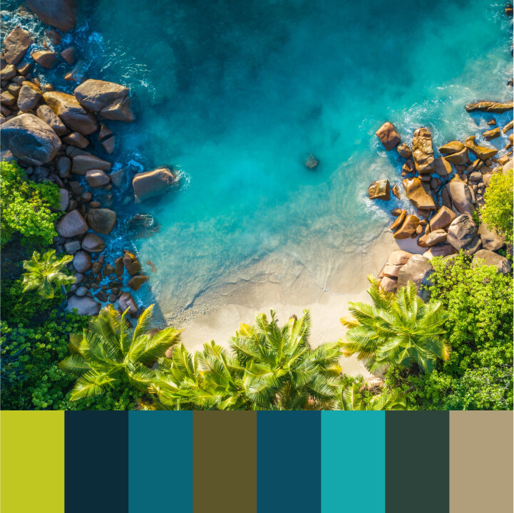
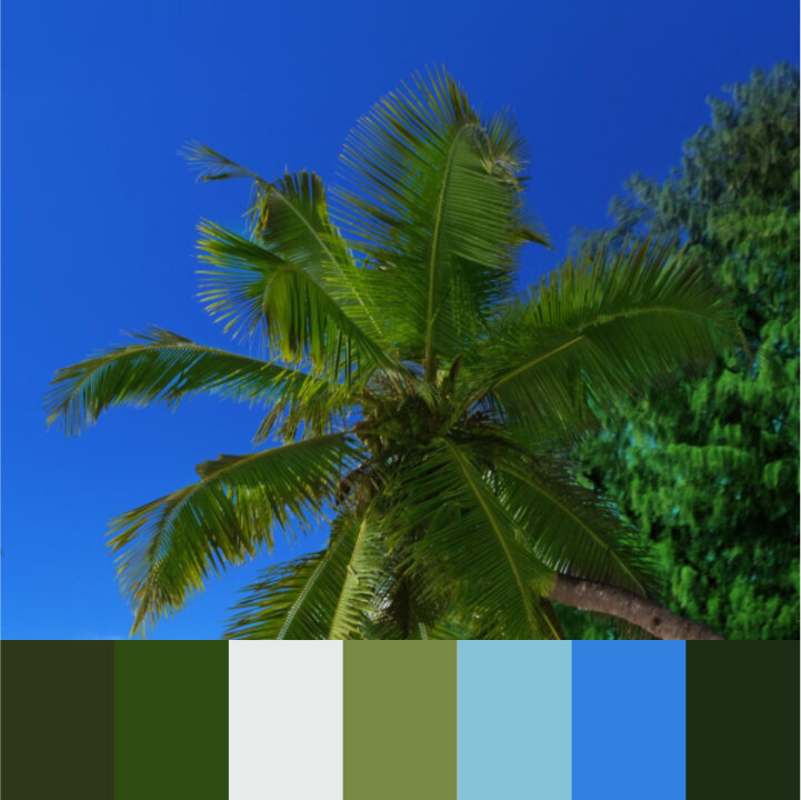
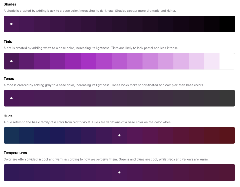
I used numerous tools and methods for discovery and discussion with the Product and Marketing teams regarding color decisions. Both in nature and in Pacaso’s photography, life and richness is communicated through vibrant, saturated colors, and is beautifully offset by triad and tetrad desaturated earth tones. I used paletton.com, color.adobe.com, and colors.co for detailed color ramp exploration.
Pacaso Home Photography
Pacaso Home Photography
Green Color Palette
Green Color Palette
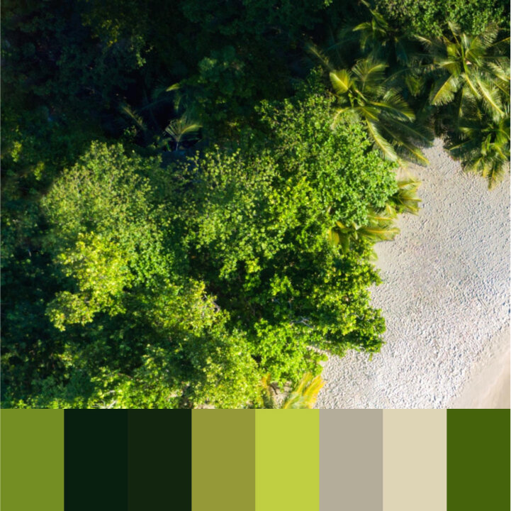
Green Color Palette
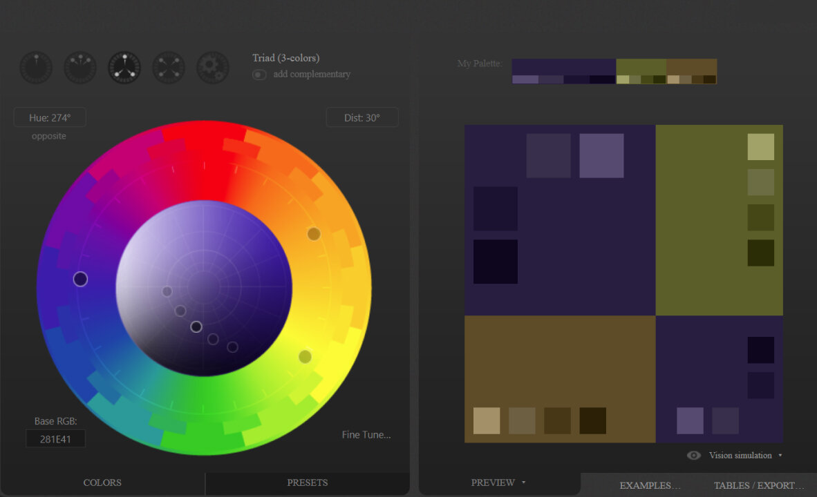
paletton.com Triad Colors
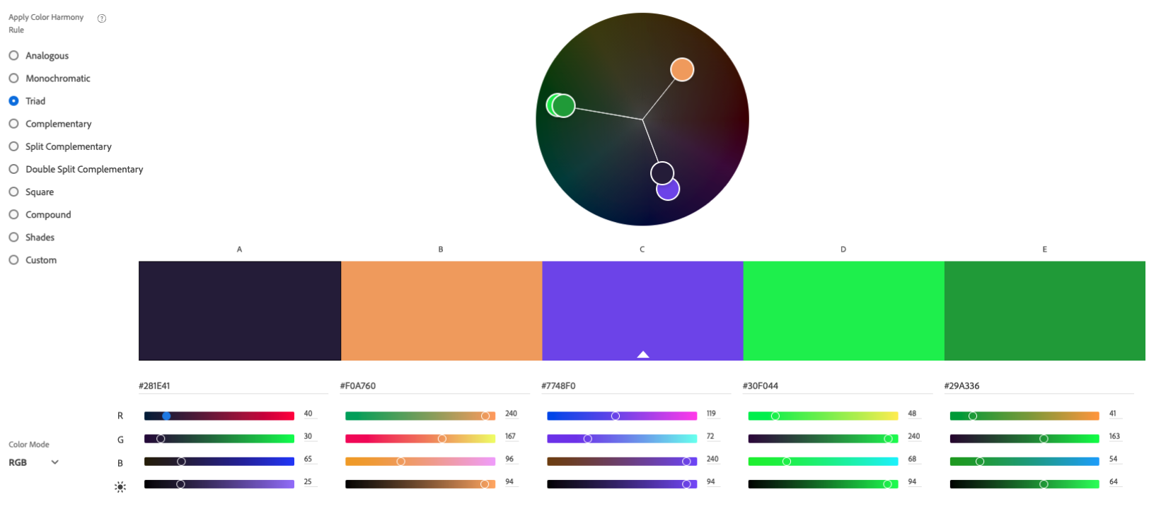
color.adobe.com
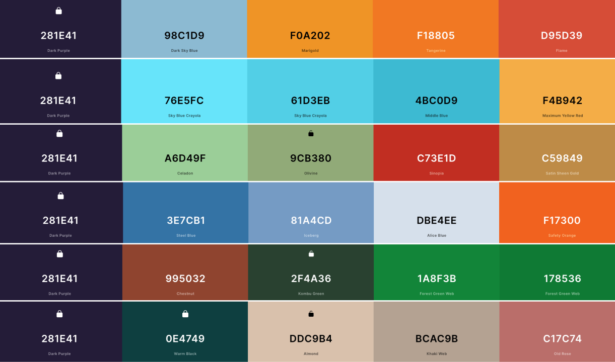
coolors.co Purple Color Palettes
coolors.co Green Palette
coolors.co Purple Ramp
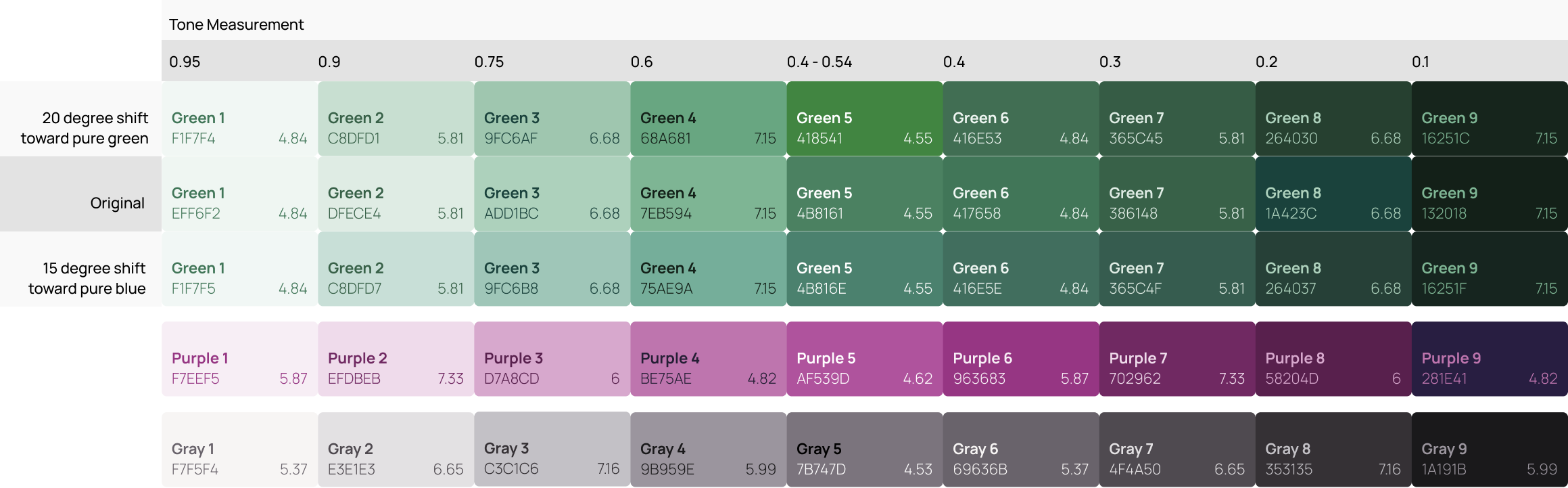
Tone Measurement
Color Planning & Accessibility
Color planning goes much further than making sure color contrast meets the well-known 4.5:1 color contrast ratio with text on a background.
There are requirements for focus indicators, component chrome (such as borders and background colors), and how does this all work when you change to a dark theme? And ultimately, how can you create an easily understandable color palette that allows your design team to make smart and accessible color choices.
Color ramps are specifically set up to help make accessible color-contrast selections.

Each color tile contains the color name, hex value, and color contrast with it's color pair.

Each vertical color pair can be used with each other (for example, text & background color) and meet the 4.5:1 color contrast requirement.

The mid-range color 500 is color compliant with both white (#FFFFFF) and black (#000000).

Each color can be swapped with any color that is 5 or more positions higher or lower and will meet the 4.5:1 color contrast requirement.

Common component chrome combinations (for example, border and background color) will also meet the required 3:1 color contrast requirement.
These include the 100 / 400 colors for Light Mode and 600 / 900 for Dark Mode.

Results
- As a fast moving startup, every designer moved quickly and helped build everything at all times. The new clear and accessible color ramps helped designers make smart decisions that led to faster development times.
- The Brand & Marketing team understood why we made certain color choices for the UI and was 100% on board!
- By planning ahead, token colors for components were more quickly created and we were ready for dark mode in our mobile apps.
Native or Custom-Branded Components?
A decision almost every product team needs to make is will we use native (mobile) components, or will we create our own? There is no cut and dry answer here... "it depends."
Pacaso was fast-moving which led us toward using native components. After all, they're already built and ready for use on Apple and Android phones. In addition, users are already used to seeing and using them. On the other hand, they can remove the user from a strong brand experience.

Moving from Native to Branded
One example of our journey is our Dialog Component. Pacaso had spent enormous time and effort in branding and establishing its luxury theme. The marketing team insisted that keeping our branding across all platforms was paramount.
I worked closely with the engineering and marketing teams to understand the effort to move away from easily-available native notifications.
This move ensured a more consistent Pacaso experience as users moved between the web, mobile web browser, and the native Pacaso app.

I created the new Dialog component for web, mobile-web, iOS, and Android and this was one more component that worked its way out of our Web Style Guide into our Core Style Guide, where a single component would be available to all designers across all platforms and could easily be swapped with one click.

Complexities Arise
In the beginning, our Dialog Component contained very little UI text. It was usually, "Do you want to do such and such? Yes / No" We now began to use this component to give home price breakdowns and longer feature descriptions. This meant the introduction of a scrollbar.

Accessibility Issues
I also began to dive into accessibility compliance for our Dialog Component. According to WCAG 2.1, we needed to support 200% zoom without loss of content. This meant that in our worst case scenario, we had to fit our Dialog into a 320 px width, support a close button, status icon, title area, 200% zoomed content, a scrollbar, and larger buttons.
Once I began to discuss these issues with our iOS and Android engineering teams, we reached a breaking point where we couldn't support the level of component customization and accessibility concerns without delaying other projects. Fortunately, all this was discovered while still in the design phase in Figma before engineering efforts were involved.

Summary
After numerous discussions between the Product and Marketing teams, Pacaso decided it was more important to ship quickly and maintain compliance with accessibility standards. This wasn't the decision the Marketing team wanted, but after demonstrations of all the customization and engineering work involved, at least they understood why... and were on board.
The "wheels on the bus go round and round," never stop, and everyone wants to move fast. Sometimes we have to commit to a direction, even if we know there may be issues we need to address in the future. What's important is that communication is proactive and everyone involved understands what the costs and risks are.