
“Sharing content and collaborating is an essential part of daily life.”
In order to help students, teachers, and teams to work better together, OneNote needed to design Notebook and Page sharing. My job was to lead this design.
Role
Lead UX Designer
Timeframe
7 months
Skills
Design thinking, product development, interaction design
Software
Illustrator, Sketch
![]()
![]()
The Challenge
Microsoft’s OneNote was lacking the ability to share content. There was a clear business need to add this functionality, but first we needed to understand OneNote users and their needs around sharing. My role was to be the UX and product designer to own this process.
OneNote’s challenges went even deeper:
- Other Office products were beginning to create sharing patterns but nothing was official yet.
- OneNote has more complex structures than Word, PowerPoint, or Excel – OneNote users can create numerous hierarchies of pages, sections, and notebooks.
Design Thinking & Collaboration
It’s my belief that all successful product design begins not only with your user in mind, but also your entire team. Specifically, Business, Design, and Development.
To lead the project kickoff, I facilitated several Design Thinking sessions. I made sure we had product managers from the OneNote business team, designers, and several software engineers.
I facilitated several Design Thinking sessions focusing on Discovery and Ideation.
Discovery
For our Discovery sessions, we began with understanding our audience. I facilitated exercises such as “What If” and “How Might We.” This led to groups of concepts such as Feelings Around Sharing, Motivations to Share, Being In Control, Uncertainty about Privacy, Confirmation of Sharing, and others. The “What If” exercises created enough ideas for us to create our design pillars for sharing notes.
To help us better understand the timeline of sharing (discovery, use, then telling others), I created a simplified version of the Experience Cycle (by John Rheinfrank and Shelly Evenson) and turned it into a brainstorming exercise.
Ideation
I gathered the three teams together again to do Post-It brainstorming – each Post-It held a single idea, we clustered them together and used sticker voting to organize ideas. I led a prototyping exercise where participants had paper, pens, tape, and scissors and 20 minutes to design their idea.
One of my favorite moments came from one of the software engineers:
“That was the best meeting I’ve had at Microsoft in 10 years!”
It was also the first time these engineers had participated this early in product design!
Discovery & Ideation Workshops


Research
Competitive/Comparative Analysis
I took an in-depth look at other sharing systems. I studied File Sharing systems like iCloud, file sharing on Windows, Box, Dropbox, and Google Drive. I also looked at Note Sharing and Team Collaboration features in Dropbox, Box, Google Drive, G Suite, Evernote, Google Keep, and Notes. One complexity that continued to raise its head is that OneNote scales differently than other note-taking tools. OneNote tries to be your go-to note tool for a single grocery list all the way up to managing classroom curriculum and all the classes students take. The key was to refocus on our primary set of users and personas.
Visiting Users
I spent plenty of time working with OneNote’s senior researcher, but more was needed. Fortunately, OneNote is the note-taking tool of choice in several Seattle-area schools and I started to visit them regularly.
The subject of my regular visits came up in our weekly Design Critique and soon after, our design director put a program in place to get all designers in front of users at least 1/2 day each month!
School Visits & OneNote “My Genius Is” Workshop


Design
Design Process
Design began with pen and paper, pulling together ideas from our workshops, personas, and research. My walls were covered with all the sketches from our Design Thinking sessions, and I continued to refer back to them for ideas.
Wireframes in Illustrator were interpreted too quickly as “final designs” so I began creating them in Balsamiq. Balsamiq was also so simple to use that our PMs were able to take designs, modify them, and share ideas visually. We tossed several dozen ideas back and forth, continuing to vet them against the simplest note-sharing scenario all the way to complex ones with multiple pages, sections, notebooks, and large numbers of users.
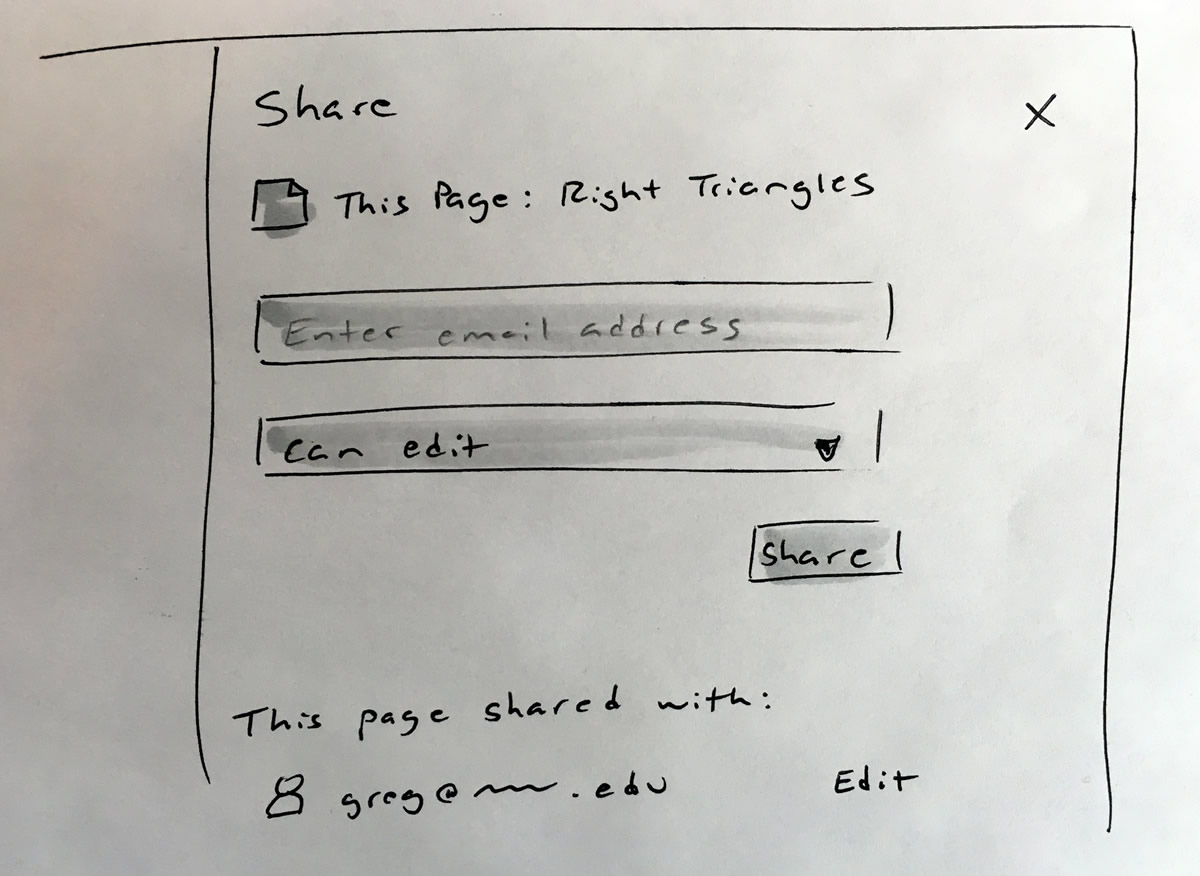
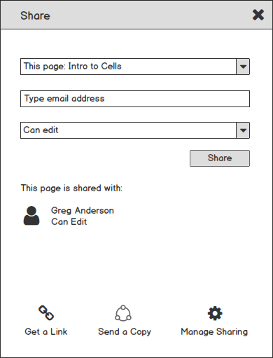
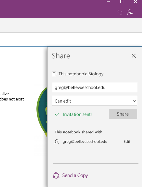
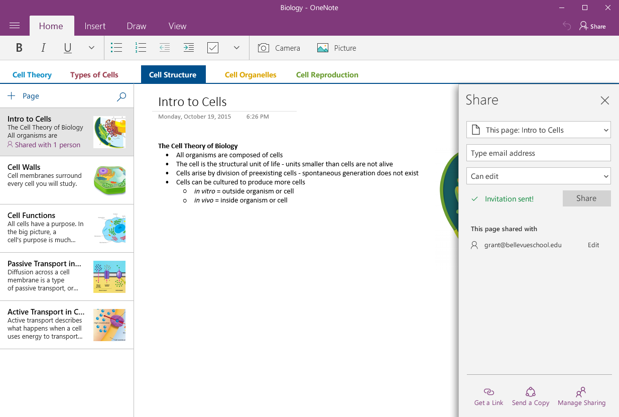
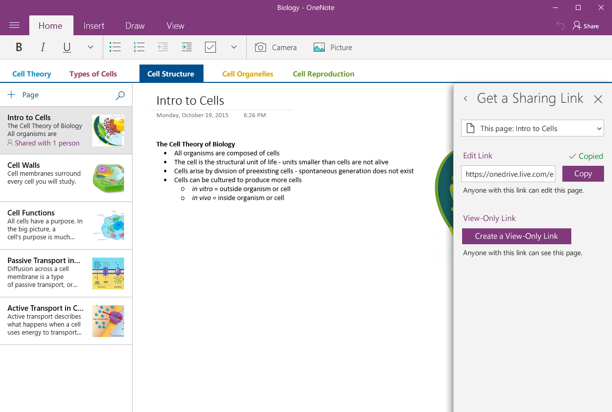
We experimented with using a Sharing Modal (below) and a Sharing Pane.
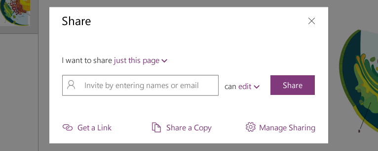
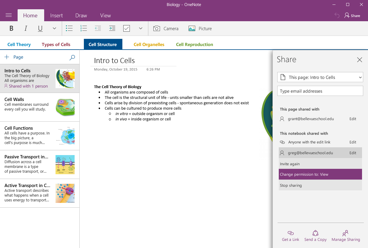
The final decision was to use the Share Pane. The Pane was becoming a more common element in all the Windows Universal Apps.
Designs also included the full end-to-end experience for the user receiving the shared Page or Notebook. I designed the recipient’s email and worked through paths for them to accept the share in either OneNote, NoteNote Universal, or OneNote Online.
Gaps became clear during this stage. One glaring example was that we had all been so intensely thinking about how to share and what to share, we had forgotten about managing that sharing once it was done.
The other gap that came up was that sharing is a two-way street. Classrooms, notes, and student projects are collaborative environments. This means that it’s not enough to know what I’m sharing with you, but I also want to have insight into what you are sharing with me. Why? Users may need to clean up their OneNote, extend editing privileges… the list goes on. It got very deep very quickly.
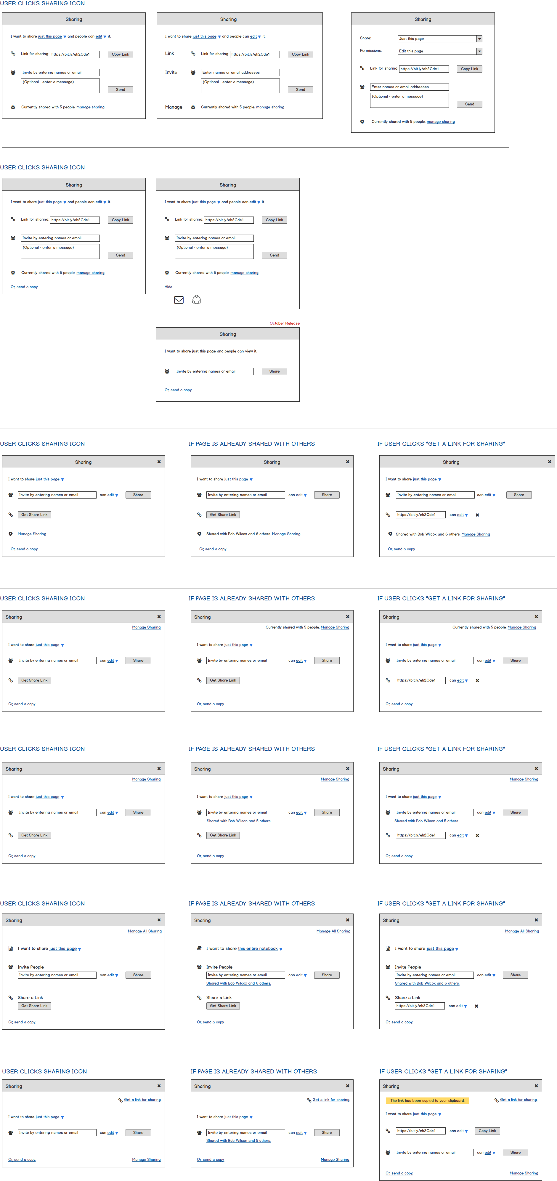

Share Pane Screen Evolutions
Initial Sketches
Wireframes
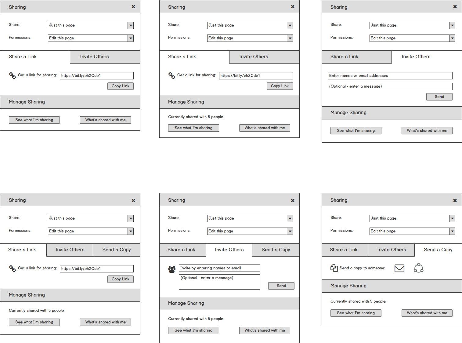
Final Designs
Design Challenges
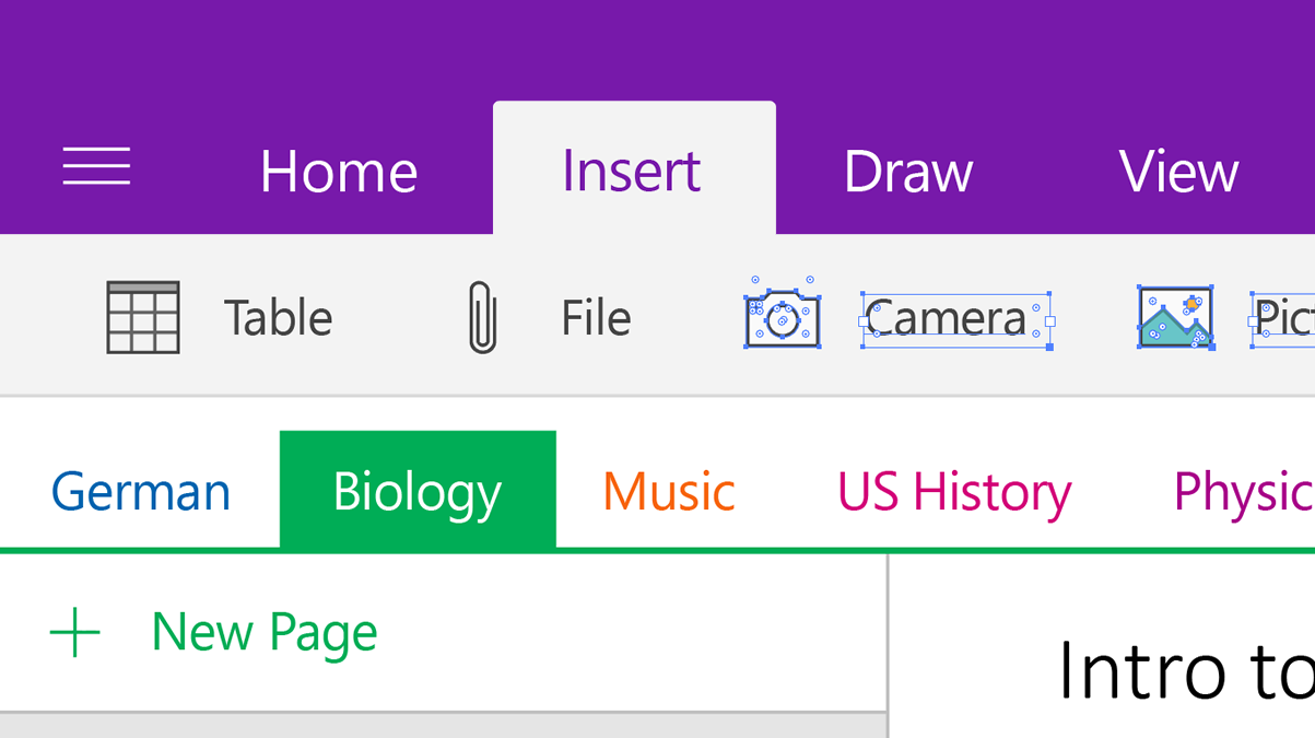
Menu Structure
One specific challenge was the design changes that were needed for the OneNote Menu Panel. Before sharing, users saw:
- Their own notebooks
- Recent Notes were always their notes
Sharing added a brand new mental model, new IA problems, and design complexity:
- The menu panel now contains your own notebooks, notebooks you have shared with others, and notebooks others have shared with you
- How important is it to see what is shared?
- How important is it to see what you are sharing with others versus what others are sharing with you?
- Is this too much information for the Menu Panel to own – should it live elsewhere, such as Manage Sharing?
- When does iconography cross the line from informative to too busy to quickly understand?
- Recent Notes – are these yours, someone else’s, or both?
I designed numerous Panel options, all of which went through rigorous debate and critique, and finally user testing.
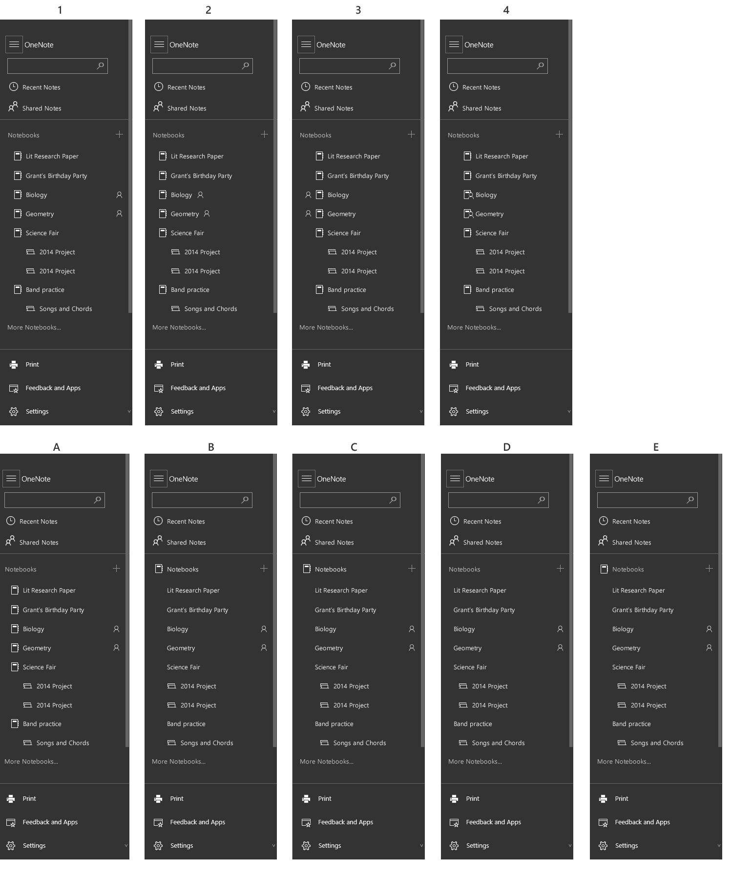
Click Image to View More Options
Menu Filter Options
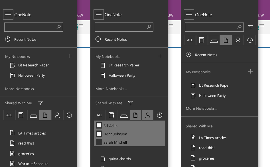
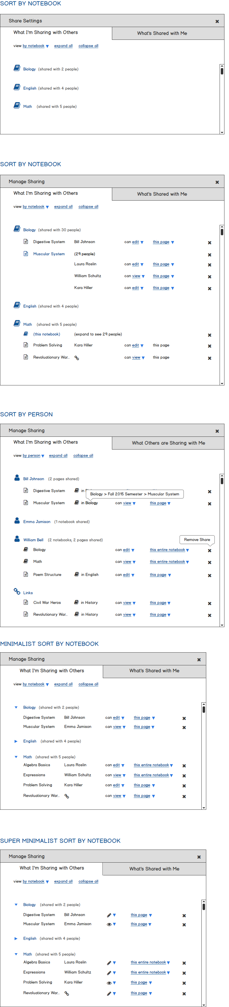
One of our design tenants was balance – that at the center of being in control users wanted to be aware, but not distracted by sharing information. Another challenge was helping users achieve this balance. Therefore, I created several designs for managing sharing inside the Menu. I added a “Shared With Me” section and filters to help users with large amounts of shared content.
Ultimately, we felt these designs fell too much on the side of being distracted (too much information). This was especially true for new, non-power users and it was removed from the Menu.
Share Pane Location
Another design challenge was the location of the Share Pane. The Pane would slide in from the left side but where should the top align? Should it be flush with the Page, the Section, or overlap everything?
Each location inferred something different to users.
- Top-flush with the Page top closely inferred that the sharing affected the Page, but not the Section, or entire Notebook
- Top-flush with the Section Bar more closely inferred that sharing affected the Section, but could also cover the Section title
- Having the top of the Pane in the Ribbon Bar inferred more of a universal setting and users lost the concept that they were sharing a Page

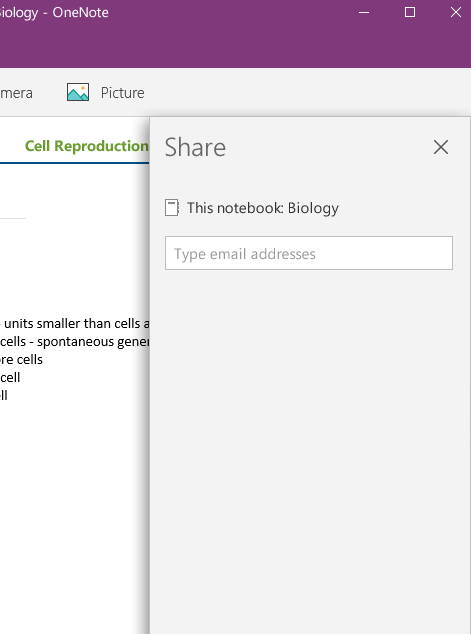

Our final decision was to align with Ribbon Bar. None of the placement decisions was a clear winner, but it was easier for users to image a high-level setting covering smaller things (like Sections and Pages) than it was to view a “Page-level setting” having control over the entire Notebook.
Later in the year, we aligned the Panel with the bottom of the Ribbon, knowing a new design direction for OneNote would move Sections away from the top and to the left-hand side.
Usability Testing
I can attest to the fact that Microsoft takes user testing seriously. The new sharing designs went through rigorous testing – several week’s worth and the labs are state-of-the-art!
For weeks, most of our designs contained educational material, such as biology and math classes. However, testing students was more difficult for legal reasons. Our researcher did an amazing job creating the tests and scripts, but our scenarios didn’t fit the users we could actually bring in for testing. I helped rewrite our scripts in such a way that we were still testing all the primary criteria, but with scenarios that were a better fit. For example, to test users’ understanding of sharing confidential information, I devised a scenario where a notebook contained financial information in various sections and pages. The user needed to share various parts with a CPA, a family member, and a friend.
The researcher and I presented results to our PM team frequently and we iterated often, sometimes with new designs for the next day of testing.
(Please note that while very functional, this particular prototype was meant to support the testing protocol so not everything works.)


Final Product
Other Artifacts
One item that was missing from the design resources at OneNote was a set of components in either Illustrator or Sketch. Even designers were taking screenshots of the actual product and touching them up in Fireworks or Illustrator. There was no current, single source of truth.
I took it upon myself to create, from scratch, OneNote (Universal, Win 10) in Illustrator. Since it took too long to get the actual icons from outside teams, I recreated them as well.
The illustration was built to be flexible:
- The Home, Insert, Draw, and View ribbons could be turned on or off
- The Share Pane could be turned on or off and had various states of sharing pre-drawn
- Sections could be added, edited, or removed and they would all maintain proper spacing
- New pages and page previews could be turned on or off
The final result was a current, accurate version of OneNote in Illustrator that all design teams could use. Since I had taken the time to properly label the several hundred layers, the motion design team was able to import the designs straight into After Effects for motion work, saving them weeks of drawing from scratch.


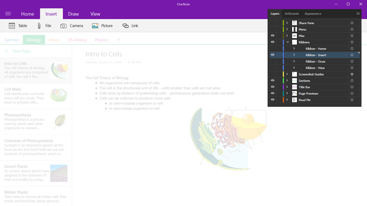


Illustrator Design Components
I designed the components such that each one could be turned on or off, modified, or rearranged. Shown are the Ribbon Bar menu layers.